- Home/
- Comparisons/
- Photographers/
- Grayscale vs Monochrome Photography
Grayscale vs monochrome photography: Is there a difference?
Comparing grayscale and monochrome photography based on image quality, creative effect, and more
Hire a photographerPublished on
Key Facts
Grayscale in photography refers to an image with no colour information. It consists solely of varying shades of grey, ranging from pure black to pure white.
Monochrome photography refers to an image using different shades of a single hue. It can include colours like sepia and cyan, but it focuses on eliminating the distraction of multiple colours.
Have you recently seen a photo exhibit with vintage black-and-white photos and wanted the same effects for your family pictures? Or maybe you want to experience a fun, creative solo photoshoot. If so, it’s wise to learn about different types of black-and-white photography, like grayscale vs monochrome. This way, you can set clear expectations with your chosen photographer and receive your desired output.
What is grayscale in photography?
 By removing color, grayscale enhances facial expressions and ambient light patterns. (Source: iStock)
In photography, grayscale refers to images that do not contain colour information. They only contain different brightness or luminance levels, ranging from zero luminance, pure black at the darkest point, to maximum luminance, pure white at the lightest point.
Historically, grayscale photography is known as black-and-white because black-and-white was the only type of film available at the time. When colour was first added to photographs in the 1900s, the term ‘grayscale’ eventually emerged to differentiate coloured and non-coloured images. Grayscale is a more accurate term than black-and-white because of its monochromatic nature, which uses varying grey shades to produce a non-coloured image.
Despite the introduction of coloured images, grayscale remains a popular photography style today because it promotes artistic expression. The absence of colour draws the eye to other photographic elements like shapes, textures, and forms, allowing for more interesting visual storytelling.
What is monochrome in photography?
 A solitary moment enhanced by monochrome’s ability to evoke nostalgia and depth. (Source: iStock)
The word ‘monochrome’ means one colour because it comes from the Greek words mono, which translates to ‘one,’ and chromos, which translates to ‘colour.’ From its definition and origins alone, monochrome photography already means producing images of various shades of one colour or hue.
Although monochrome photography is usually black-and-white, this doesn’t mean all monochrome images are black-and-white. It sounds confusing, but it just means monochrome images can have other colours like red, blue, sepia, etc.
The main purpose of monochrome images is to remove the distraction of multiple colours. This allows the photographer to shift their focus to other elements like light, composition, and texture, creating deep and impactful images.
Monochrome vs grayscale: How do these photography styles differ?
Bear in mind that grayscale and monochrome photography only works for specific subjects or occasions. Hence, it pays to know more about these photography styles to choose the right one for your next photoshoot project.
In terms of colour representation
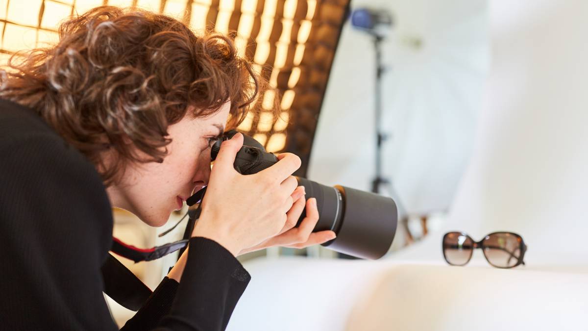
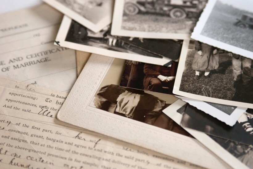 Vintage prints demonstrate early monochrome photography before digital grayscale. (Source: iStock)
As mentioned, grayscale photography only renders images without colour. The entire image is purely grey, black, and white. Moreover, the various grey tones you see in a grayscale image are due to each tone having a different brightness or luminosity level.
On the other hand, although a monochrome image only has one hue or colour, it is much more versatile. In addition to the standard black-and-white photos, a monochrome image can have a cool tint with various tonal variations of blue, including deep navy blue and pale sky blue. It can also have a warmer sepia colour with dark orange tints and deep brown shades.
In terms of image quality
The quality of any image matters, whether in film or digital photography. It enhances the subject's overall visual appeal and improves the expression of emotions.
Regarding grayscale and monochrome photography, grayscale usually renders a higher image quality. Grayscale images use the full spectrum of greys, so there’s a smooth transition between shades and no harsh contrasts.
Consequently, it’s easier to see the most intricate details in the photo. Moreover, the different textures stand out more since grayscale images don’t use colour. This makes grayscale images capture the three-dimensionality of the subject and appear more realistic.
Meanwhile, the image quality of monochrome photos depends on the chosen colour. Although they can be deep and impactful, they sometimes lack depth, meaning they fail to emphasise the most subtle details.
For instance, if you choose a neon colour like pink, it doesn’t have a range of shades or tonal variations because neon colours are high-intensity, meaning they are bright and saturated. Mixing neon colours with black or grey will quickly desaturate them, removing their distinct brightness.
In terms of creative effect
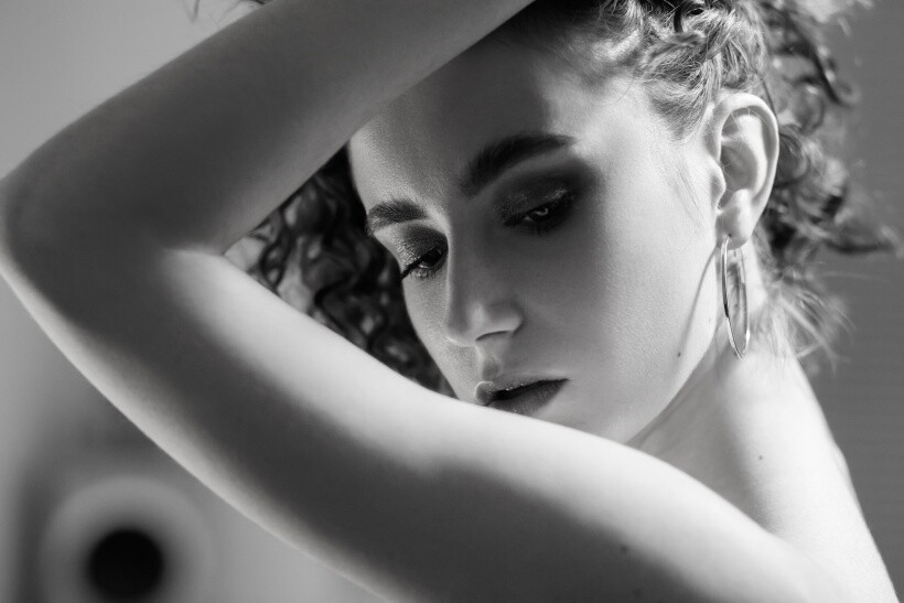 Monochrome portraits like this use contrast to express artistic emotion. (Source: iStock)
Creative effects in photography don’t only mean adding interesting textures or details to make the image look unique. It also involves capturing emotions in the photo, producing a dramatic output as if the pictures tell the story of a subject.
Both monochrome and grayscale photography can add a creative effect to images. However, monochromatic photography offers more creative flexibility, given the wide range of colours you can use.
The colour you choose will dictate the mood or vibe of the photos. For instance, a monochrome image with warm sepia tones will create a more nostalgic feel. Meanwhile, blue tones like cyan evoke a calm atmosphere.
On the other hand, grayscale photography usually evokes a more dramatic, historical, and creative feel since it produces black-and-white images reminiscent of the old times. Not to mention, the absence of colour allows the viewer to focus on the mood and emotional detail of the headshot or portrait image.
In terms of editing
Thanks to various technological advancements in photo editing and retouching, it’s now easy to edit grayscale or monochrome images.
However, between the two, grayscale images are easier to edit, as they only have various shades of grey. This allows the photographer to focus only on specific elements, like brightness and contrast, without worrying about whether the colours look balanced.
Moreover, photo editing tools nowadays have a pre-built feature that allows you to convert images to grayscale easily. These are called grayscale presets, and you can apply them to every photo in a large batch for a more uniform look and an efficient editing process.
Although you can also find monochrome presets in tools like Photoshop, there’s a lot to tweak in a monochromatic image. Aside from adjusting the brightness and contrast, the photographer should know colour theory to select the right tone and intensity for a seamless blending of colours. If not, this could lead to inconsistencies, making the final output look awkward.
In terms of printing and reproduction
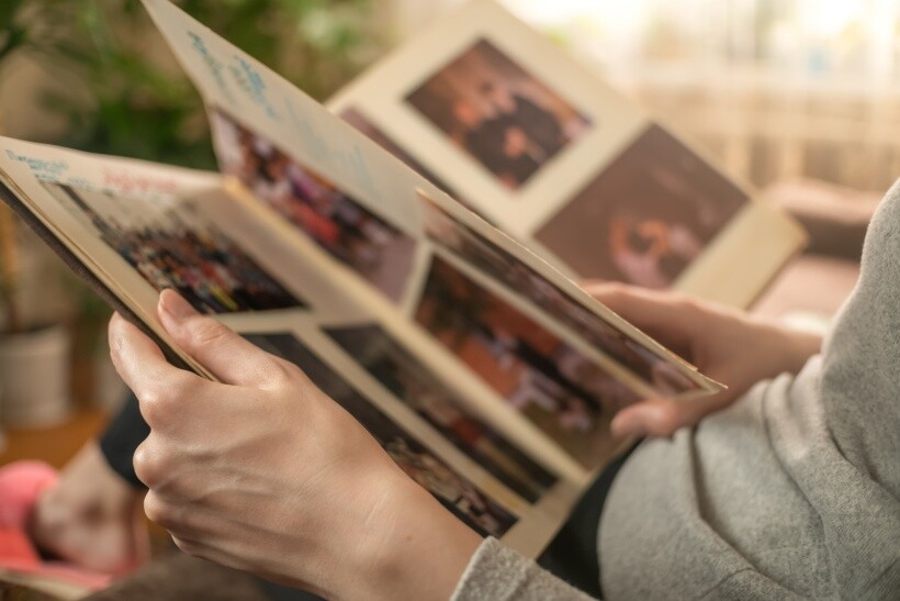 Revisiting memories through different tones—grayscale for realism, monochrome for mood. (Source: iStock)
Even though digital copies are now more of a fad, some people still want their photos printed as a keepsake. Between grayscale and monochrome images, printing a high-quality grayscale image is easier because it primarily uses black ink to produce different shades of grey.
Some printers use colour inks like cyan, yellow, and magenta to achieve finer grey gradients, tones, and details, but these colour inks are only minimal. You need to calibrate the printer carefully to reproduce accurate monochrome photos. The process is more complex, especially if the monochrome image has hues other than black.
Bring your photo ideas to life with Airtasker
Knowing the difference between grayscale and monochrome photography is just the tip of the iceberg. You still have to look for a photographer who can execute your photo ideas while sticking to your set budget. If you haven’t booked anyone yet, consider Airtasker. By posting a task on the platform, you can connect with a photographer near you and finally start your passion project!
Grayscale vs monochrome photography
Grayscale Photography |
Monochrome Photography |
|
|---|---|---|
Colour Representation |
No colour, only various shades of grey from black to white |
Uses one hue or colour, which can include tints and shades (e.g., sepia, blue) |
Image Quality |
Generally higher quality with smooth transitions between shades and detailed textures |
Quality depends on the hue used; can lack depth and subtle detail |
Creative Effect |
Evokes a dramatic, historical feel, focusing on mood and emotion |
Offers versatile creative options with different hues affecting the mood and atmosphere |
Editing |
Easier to edit due to focusing only on shades of grey; often uses grayscale presets |
More complex editing; requires an understanding of colour theory to adjust tones and balance |
Printing and Reproduction |
Easier to print; primarily uses black ink with minimal colour adjustments needed |
More complex printing process; may require careful calibration for accuracy |
FAQs on grayscale photography and monochrome photography
Black and white photography refers to images limited to shades of grey, while monochrome photography refers to images with varying shades of a single colour; they can be sepia, cyan, red, blue, etc.
One trick to capture dramatic monochrome images is to find a subject with different shades, interesting shapes, and textures. Shooting in RAW format would also help you adjust the contrast and brightness more easily during the editing and post-processing process. Lastly, use lens filters like polarisers and neutral density filters in your camera so your photos won’t look too vivid when shooting in bright places.
It eliminates all the colours in the image, leaving only varying shades of grey. This allows you to see the light and dark parts of the picture better, making editing and post-processing easier.
Find photographers, fast
Post a task
Related articles

Related price guides

How much do photographers charge?
Read more
How much does pet photography cost?
Read more